Designing a Direct-to-Consumer Art Brand, 0 to 1
Designing every touchpoint of a new product, catalog, storefront, go-to-market, drove 50% of inventory sold in a single day and an 8% conversion rate, roughly double the industry average.
The Challenge
In 2022 I wanted to test something I couldn't answer sitting at a desk: could original art become an everyday, ownable product instead of just something that hangs on a wall? I had no team, no existing audience, no capital runway. What I had was a body of hand-painted work and a 49-day window, working remotely from Goa, to design, build, and ship a complete commerce product before heading home.
How do you design, launch, and validate a new consumer product end to end, brand, catalog, storefront, go-to-market, with no team, no ad budget, and one shot at a first impression?
Company
Deech (independent, founder)
Timeline
2022 - 2023
Role
Founder, Product & UX Designer · User Research · Information Architecture · Brand & Visual Systems · Growth & Launch Design · Service Design

Discovery & Research
Understanding trust before designing a single product
Before designing anything, I needed to understand two things: what makes someone buy art they've never seen in person, and how independent creators were already earning that trust online.
20 Days
Field Research
Embedded in the market: sketching, testing motifs, talking directly to buyers in Goa's art and tourist economy.
D2C
Competitive Scan
Benchmarked Instagram-native brands across fashion, home goods, and art prints. The pattern held across all three.
"Buyers didn't ask 'is this good art?' They asked 'do I understand the person who made this?'"
Across every conversation, the same behavior kept showing up: people made the decision to buy while watching the process unfold, well before the finished product ever appeared.
Competitive Scan
Instagram-native D2C brands,
benchmarked across three verticals
Fashion, home goods, and art prints - the same trust pattern surfaced every time.
Primary Driver
Not Primary
AP
Art &
Prints
HG
Home
Goods
FA
Fashion
Story-led captions & founder voice
Spec-first product listings
Process & behind-the-scenes content
Consistent across every vertical: story and process outsold specs. That's what shaped how Deech's catalog and site content got built.
Core Insight
The product was never just the object.
Buyers weren't purchasing a scarf or a painting. They were purchasing proximity to a process, a place, and a person. A single original painting could only ever reach one buyer. The insight was that the same imagery could become many products at many price points, stretching one story into many formats without watering it down.
Don't sell the object. Sell the story and let the story take many forms.

Design Principles
Four constraints, not values
Each principle came from something the research surfaced. Each one became a test for every decision that followed.
01
Familiar over polished
The name comes from a nickname. A human tone runs through every surface, because trust converts faster than production value for a first-time buyer.
02
Mobile-first, always
The vast majority of discovery happened on Instagram and WhatsApp. Every screen was designed for a thumb, not a cursor.
03
One story, many formats
Every product had to trace back to the same source imagery and narrative, so a 55-item catalog reads as one collection, not scattered SKUs.
04
Design for the first 10 minutes
Most buyers converted within a single session. Browsing and checkout had to work with zero explanation.
Product & Information Architecture
Structuring a catalog that didn't exist yet
55 products across 6 categories, spanning a 30x price range, organized so a first-time visitor could find an entry point in seconds.
55
products across 6 categories
Scarves
Paintings
Coasters
Bookmarks
Boxes
Posters
$50
$500
A 30x price spread used deliberately as an entry ladder - a $50 bookmark and a $500 original painting sit in the same collection, giving every visitor a low-risk way in.
Browse Flow - for the casual scroller
1
Instagram post
2
Profile link → mobile site
3
Category grid
4
Product detail
5
WhatsApp order
Built for low commitment - someone deciding whether to trust the brand at all.
Direct-Intent Flow - for the warm follower
1
DMs the brand directly
2
Conversational catalog
3
Pre-booking
4
Payment
Built for speed - someone who already trusts the brand and just needs a fast path.
Two entry points, one lightweight system - a single WordPress + WhatsApp stack that let one person run full commerce operations without a dev team or a CRM.
The Design - IOS & Android Mobile Store Front
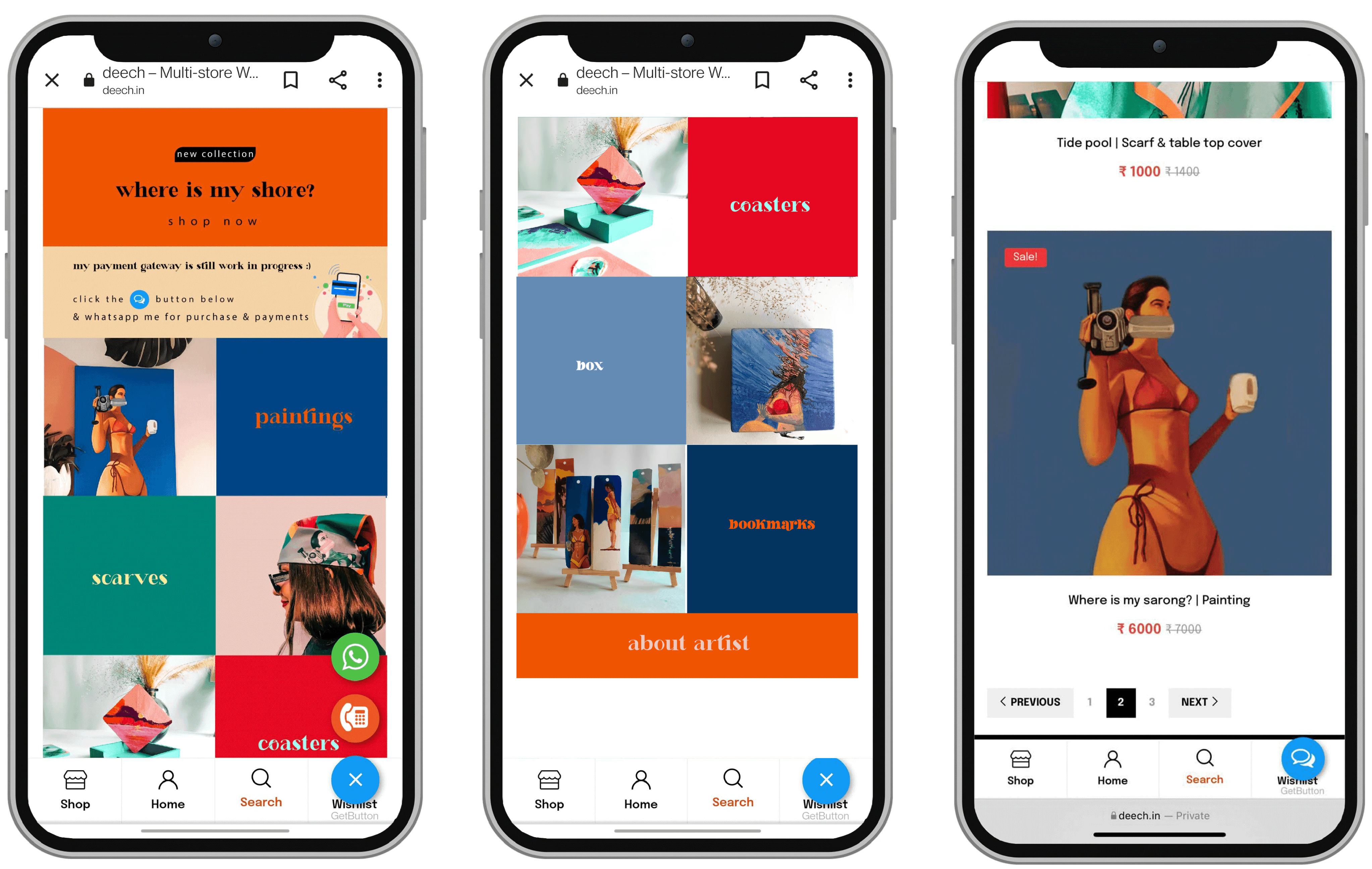
Built on WordPress as a mobile-only storefront, since almost every visitor arrived through an Instagram bio link or a WhatsApp share. Bold, full-bleed category tiles carried the Browse Flow, and a floating WhatsApp button stayed one tap away on every screen for the Direct-Intent Flow.
Visual & Brand System
One identity, executed solo across every touchpoint
"Everything is a Canvas." The identity needed to work on a black Instagram grid, an orange sale sticker, and cream packaging tape without ever being redrawn. Logotype, color, type, and photography were all built to travel together, covering work that a larger team would normally split across a brand designer, a photographer, and a front-end developer.
Logotype & Variations
Deech
Deech
Deech
Deech
Bold and minimal by necessity - one wordmark, no icon, so it reads at a glance on a phone screen and holds its shape shrunk down to a packaging sticker.
Typography
Display logotype only
Deech
A high-contrast bold serif, reserved for the wordmark and hero headline moments - never in body copy, so it stays a signal, not a habit.
Headers & body
Aa Bb Cc Dd
A geometric sans for everything else - category tiles, product titles, captions - chosen to stay legible at the small sizes a mobile-only storefront demands.
Color System
Signature Orange
#FF5203
Ink Black
#000000
Paper White
#FFFFFF
Warm Sand
#E7D0AE
Deep Teal
Bright Teal
Terracotta
Coral
Poppy Red
Forest Green
Ocean Blue
Orange, black, and sand carry the brand across the site and packaging. Teal, coral, and poppy weren't chosen in a swatch book - they were sampled from the paintings themselves, so the palette could never drift from the art.
Product Language


Every product shot uses the same three props such as dried pampas grass, a glass vase, and warm daylight — so a scarf, a coaster, and a painting all read as one collection even photographed months apart.
Go-To-Market as Launch System
Designed as a funnel: awareness → activation → retention
Rather than a single launch day, go-to-market was structured as a 3-stage system mirroring a standard product funnel.
TEASER
AWARENESS
60+ IG accounts
+300% impressions (1.02M reach) · +1,427% followers · 30% stock pre-sold
LAUNCH
ACTIVATION
Storefront live
~2,500 site visits · 8% conversion (vs 3–4% avg) · 50% sold Day 1 · 20+ custom requests
SUSTAIN
RETENTION
Community loop
9 months at 600%+ margin · repeat customers · organic reach, no ad spend
3–4%
8%
Industry average conversion rate
Deech launch-day conversion rate
Social Media Activation
A 15-day countdown, one reveal a day
The teaser phase wasn't a single announcement. It was a daily habit. Starting at T-15, each post counted down and revealed one new piece from the collection, so the full catalog only became visible the day the storefront opened. Nobody, including me, knew what day one would actually look like until it happened.


15
Daily countdown posts, each revealing one new piece before launch
60+
Partner Instagram accounts cross-promoting the countdown daily
1.02M
Impressions reached - a +300% lift over baseline
+103%
Engagement lift - 2,981 interactions across teaser posts
30%
Of total inventory pre-sold before the storefront even opened
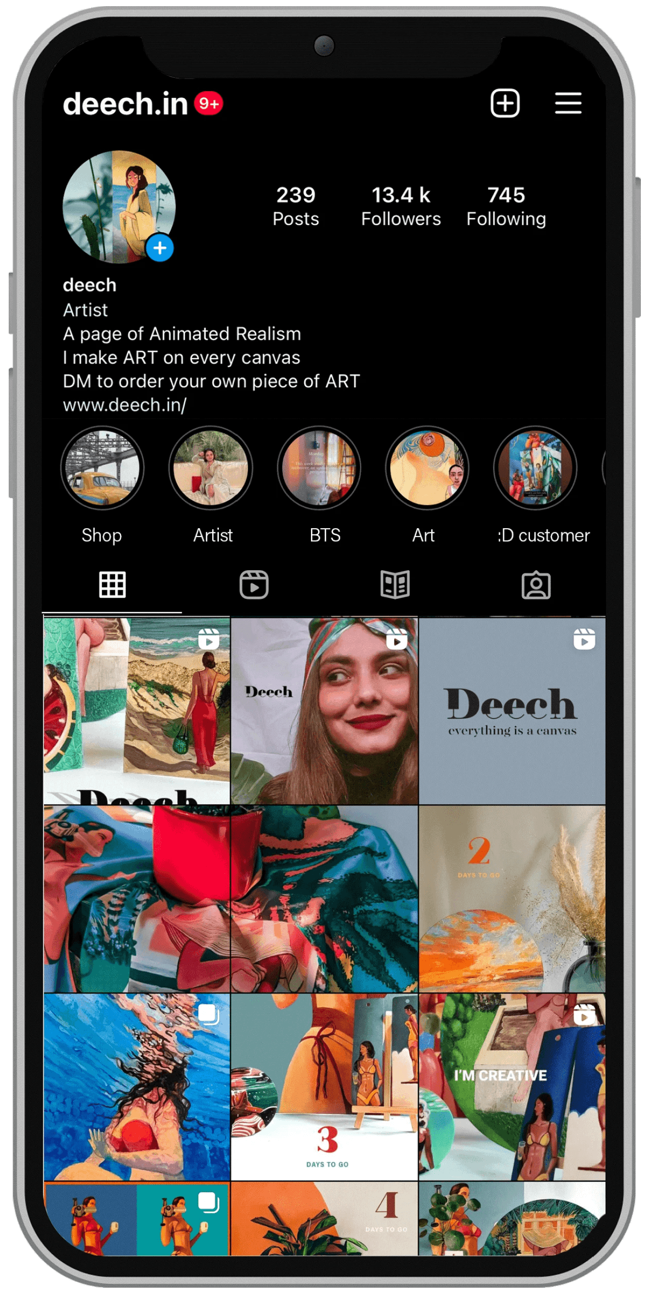
239
Posts on the account today - the countdown was the start of a habit, not a one-off
13K +
followers by the time the countdown ended
Each day's reveal gave people a reason to follow before there was anything to buy, so the audience existed before the storefront did.
Service & Customer Experience
Unboxing as an unplanned growth channel
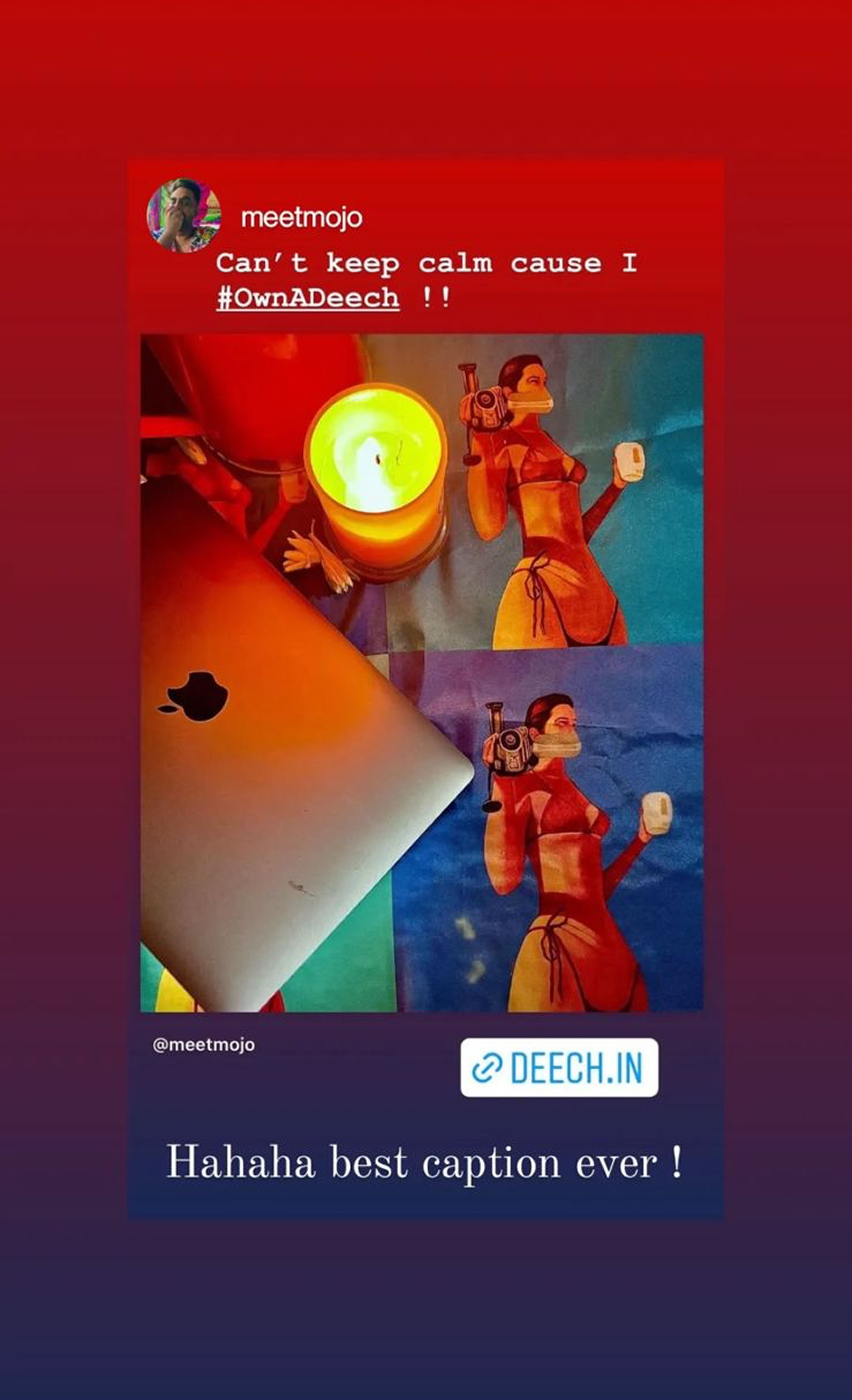
Every order was designed as an experience: kraft paper, jute ties, handwritten notes. Customers turning their own unboxing into Instagram content became an extension of the awareness loop, a signal I hadn't planned for but learned to design around.




Impact
Every number below traces back to a design decision, not a marketing budget: a 30x price ladder that gave people a low-risk way in, a mobile-only storefront tuned for a single session, and a launch built as a 3-phase system instead of a single announcement. None of it ran on paid ads.
55
Products across 6 categories
8%
Conversion rate - ~2x industry average
50%
Of inventory sold on launch day
+1,427%
Follower growth in the teaser phase alone
9 mo.
Sustained at 600%+ margin
20+
Custom design requests, generated organically
Reflection
Shipping is not the end of thinking
This started as a brand experiment. It turned into a compressed lesson in owning a full product loop solo (research, IA, design, launch, retention) and living with the consequences of every decision, because there was nobody else to hand it to.
What I would do differently: The launch funnel was designed around engagement and sales, not learning. I never built a structured feedback loop with buyers after purchase, so I can't fully explain why the 92% who didn't convert dropped off. The next version of this system would track that from day one.
What remains open: Personalization and CRM. The brand knows its story. It doesn't yet know its individual customers well enough to design around them.