Designing Discovery for 100 Years of Creative Work
How restructuring 140,000 products around user intent drove a 2% increase in monthly revenue on Amazon.in.
The Challenge
Emily Carr University holds over 100 years of creative work, graduate theses, paintings, films, installations, critical writing. Students came looking for inspiration. Most left empty-handed. The system was built for academic publishing; creative research doesn't fit. A migration to Drupal opened a rare window, a chance to rebuild how people find things, not just where they're stored.
How do you make 100 years of heterogeneous creative work discoverable to a researcher who doesn't know what they're looking for?
Company
Emily Carr University of Art & Design
Timeline
2024
—
2025
Role
Product Designer · Information Architect · Discovery & Navigation · Taxonomy & Metadata · Complex Systems Design

Discovery Research
Before designing anything, I needed to understand two things: how other institutions handled this problem, and how researchers actually behaved inside the existing system.
User Research
I interviewed 20 graduate students and faculty across Vancouver who actively used the collection for their own research.
Environmental Scan
I benchmarked digital collections across Canadian universities. The pattern was consistent: most systems were built for the library, not the researcher.
The way researchers described their process - following a feeling, not a keyword, pointed toward systems outside academia.
Alongside the collection, participants were also using Spotify, Pinterest, and Notion daily, systems that solved the same discovery problem at a much larger scale. Spotify surfaces undeclared taste. Pinterest connects ambiguous intent to content. Notion structures heterogeneous knowledge without forcing it into rigid categories.
The pattern across all three: the best discovery systems meet users in their own mental models, not the system's. That became the lens for everything that followed.
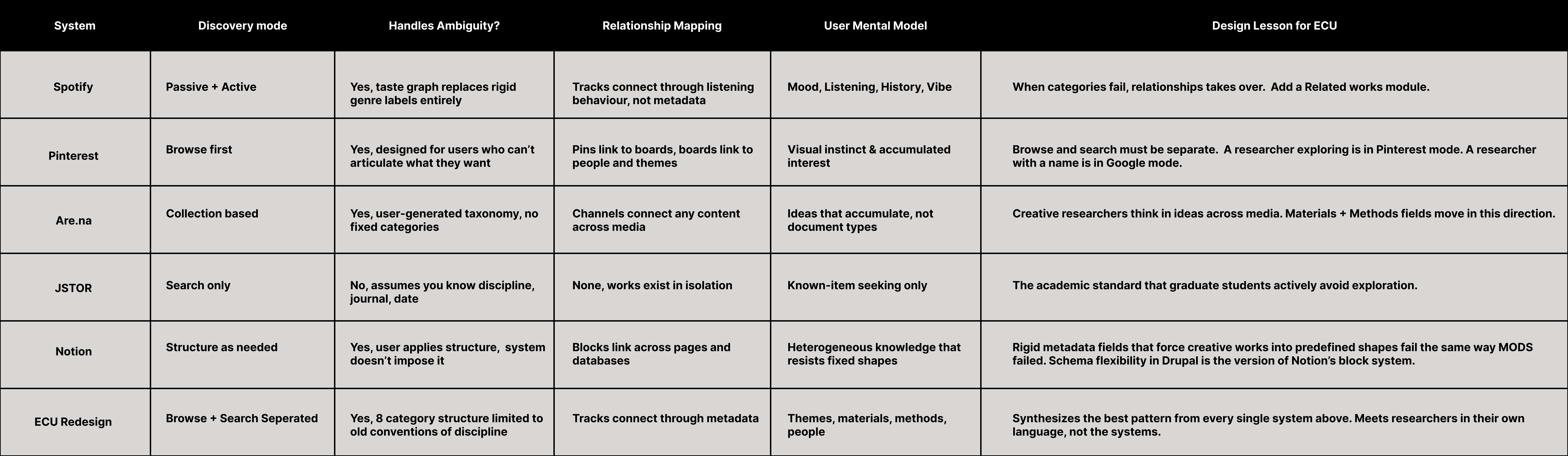
Three failure patterns surfaced in every conversation
Organizational Systems
Topic was the primary entry point. Users searched by author. The Design taxonomy was incomplete, subject-based exploration was unreliable.
"I always search by name, but half the time nothing comes up."
Navigational Systems
Relationship fields were absent from the schema entirely. Users found one relevant work and hit a wall, no way to follow threads to related people or projects.
"There was no way to see what else that person had done."
Labelling Systems
The same concept appeared under different labels across records. Search terms returned inconsistent results.
"I searched 'textile' then 'textiles' and got completely different results."
Core Insight
The system was built around the wrong question.
Librarians asked: "What is this work?" Researchers were asking: "What work feels like mine?"
Researchers don't search by classification. They search by resonance, what a work touches, who made it, what ideas it sits near. The old system couldn't answer that. It described objects. Researchers were looking for connections.
That became the principle behind every decision that followed: Stop describing works.
Start connecting them.
Design Principles
Before touching the architecture, I turned the core insight into four constraints. Not values, constraints. Each one came from something that had broken in the old system. Each one became a test: does this decision honour the principle, or compromise it?
Speak the researcher's language
Categories mirror how researchers think, themes, materials, methods, not how metadata schemas classify objects.
Connections over containers
Works don't live in isolation. The system surfaces relationships between works, creators, and ideas. Rigid categories don't.
Built to be maintained
A taxonomy no one can sustain will decay. Every decision had to be operable by library staff, no metadata specialist required.
Flexible enough to hold what doesn't fit A textile-feminist-community-ritual thesis shouldn't be forced into one subject heading. Enough structure to be searchable; enough openness to not break under complexity.
Site Map
With the design principles set, the next step was mapping the full structure those principles would need to support - not just what content existed, but how every piece connects to every other piece. The sitemap below shows the shift: the old structure was flat, with 60+ standalone subject tags and no Creator, Material, or Method fields to connect records to one another. The redesigned structure adds those fields as first-class connectors, so every thesis record sits inside a web of related people, materials, and ideas instead of a dead-end category.


Content Model
With the taxonomy restructured, the next question was how content types related to each other - not just what they were, but how they connected. The Navigational failure pattern (users hitting a dead end at every record) was a schema problem, not just a UI problem. The content model was built to fix that at the data level.
I developed the content model diagram to map relationships between content types. The full taxonomy vocabulary and field-level audit was developed in collaboration with the content strategist.

Information Architecture
To restructure the subject taxonomy, I ran card sorting sessions with graduate students, asking them to group 40 subject terms into categories that felt natural. The guiding question for each term was: what does this mean in the context of your research? - determining, for instance, whether "Textiles" belonged under Materials & Making, Identity & Culture, or Social & Political. The clusters that emerged became the 8 parent categories in the redesigned taxonomy.

Annotated Wireframes
With the architecture defined, wireframes were built to validate how the browse and search flows would work in practice - and to test the core hypothesis: that restructuring entry points around mental models, not metadata categories, would reduce abandonment.
Browse Flow
The Browse flow was for the researcher who arrives without a known destination. She has a theme, a feeling, a material - not a title or an author. Most the of users entered through the Topic facet but left without clicking a result.
Research finding that drives this: Users given a flat 60+ term list spent an average of 40 seconds scanning before giving up. Grid clusters reduced cognitive load and gave users a recognizable entry point.

Screen A - Browse Landing: 8 subject category cards displayed as a visual grid, each with a name and work count.
Screen B - Filtered Results: User selects "Materials & Making" then "Ceramics," with filter chips and a sort control shown.
Screen C - Results: Thesis cards for "Ceramics" display with the breadcrumb confirming the taxonomy path.
Search Flow
The Search flow was for precision. An advisor looking up a specific student. A researcher who already knows the name.
Research finding that drives this: author-name was the most common search query, yet no Creator field existed. The search experience was redesigned around that reality - Creator surfaces as the first filter, not buried in an advanced options panel.

Screen A - Keyword entered: Results for "textile," with filters for Creator, Subject, Medium, Method, and Format on the left.
Screen B - Filtered Search: User expands Creator and selects a name; over-filtering caused abandonment, so filters are individually removable.
Screen C - Results: Both filters applied, breadcrumb confirms the path, and 10 results return as a card list.
Record View
Where the two flows converged was the record view - the individual thesis page. This became the most important screen in the system, and the place where the core insight had to show up most clearly: stop describing works. Start connecting them.
Research finding that drives this: users who reached a record either found what they needed immediately or abandoned entirely - there was no next step. Two design decisions responded directly to that dead end.
The Related Works module turns every record into a new entry point through shared tags. Rather than being a terminus, each thesis page becomes a continuation - a way to keep moving through the collection without returning to search. This was the single most important structural change in the system. It solved the Navigational failure at the UI level.
The clickable Author field surfaces every thesis by that creator from a single name. Finding one work by someone immediately opens their full body of work.

Screen A - Record Landing:Thesis title, creator name, and compound object preview above the fold.
Screen B - Persons & Affiliations: Advisor name is hyperlinked, surfacing all theses they supervised.
Screen C - Related Works: A card grid of theses connected by shared tags appears at the bottom.
Screen D - Related Works Expanded:Full view lets users keep browsing without returning to search.
High Fidelity Prototype
With interaction patterns validated in wireframe, the high-fidelity prototype brought the full visual system to life - typography, imagery, and spacing tuned to make dense archival metadata feel browsable rather than clinical. Built across desktop and mobile with working filters and a fully navigable grid, it translated every wireframe decision (breadcrumbs, filter chips, the Related Works module) into a real, clickable interface. This was the version tested with the 20 participants in the next phase.

Testing & Outcomes
User testing was conducted with 20 participants across graduate student and faculty profiles. Each session ran 90 minutes. Participants were given three tasks: find a thesis by a specific creator, explore works related to a given theme, and navigate from a single record to a connected work without returning to search.
Key findings:
Participants completed the browse task 73% of the time, compared to 23% on the old system.
Time spent scanning the subject taxonomy before selecting a category dropped from an average of 40 seconds to 20 seconds with the grid format.
The Related Works module was used by 70% of the participants without prompting.
"Direct quote from a testing participant- I didn't feel like I hit a wall this time - I just kept finding more things."
Reflection
This project started as a migration. It ended as a rethinking of what discovery means in a creative archive.
The old system asked: what is this work? The new system asks: what does this work connect to? That shift - from description to connection - changed the schema, the taxonomy, the navigation, and ultimately the experience of every person who enters the collection looking for something they can't yet name.
What I would do differently: The taxonomy was rebuilt collaboratively through card sorting, but the maintenance model - how library staff sustain it over time - was documented but not tested with the people who will use it. The next phase of this work would be a staff-facing audit workflow that prevents the taxonomy from decaying back into the state we found it in.
What remains open: Personalization. The system now surfaces connections between works. It doesn't yet learn from individual researchers. That's the next layer of the discovery problem.
